Plumbing Website Redesign Concept
Client
Dallas, Texas, United States
Location
Dallas
Industry
Plumbing
Improved clarity, faster decision-making for users, and a structure designed to increase service calls and bookings
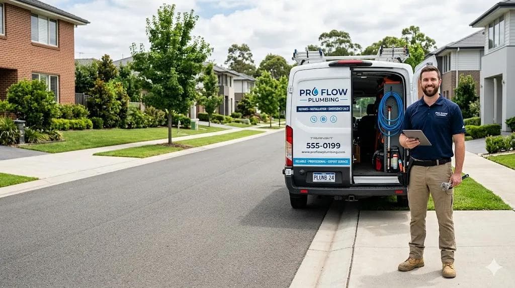
A service business that needed to stop losing calls.
Dallas, Texas, United States operates in a high-intent, emergency-driven market where a visitor's decision window is measured in seconds — not minutes.
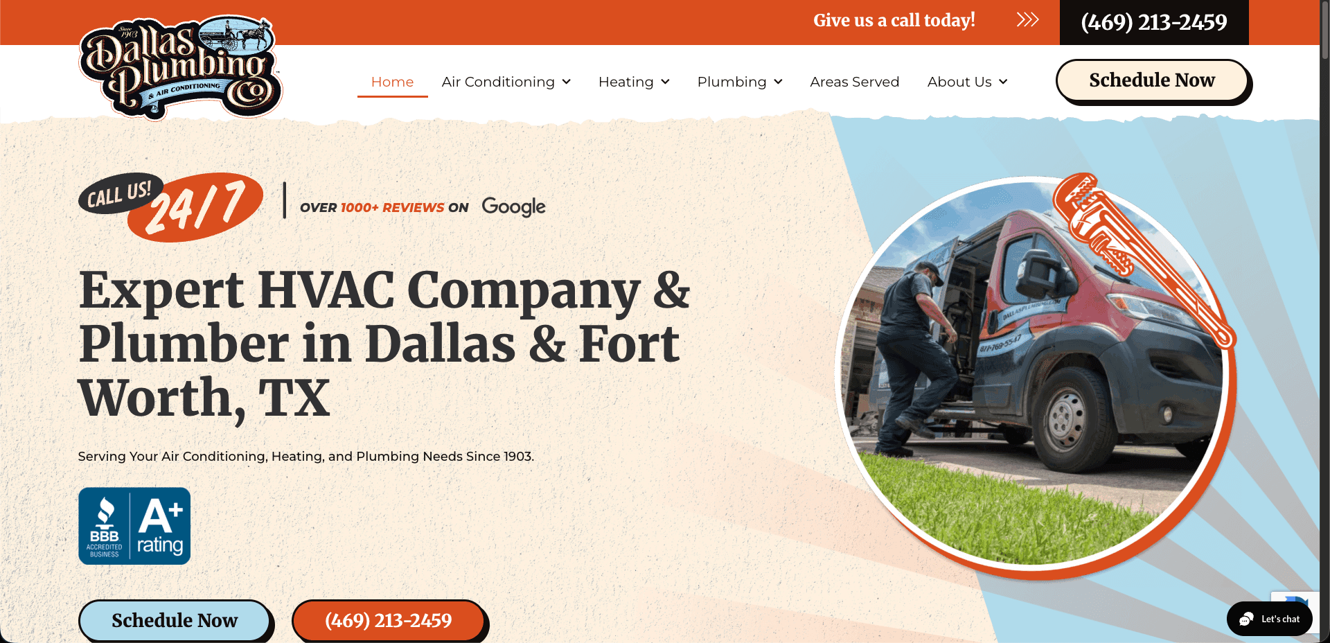
The old site was designed to look good.
Not to convert.
The original website presented several issues that can reduce conversion rates: – Cluttered layout with too many competing elements – Weak and inconsistent call-to-action placement – Outdated visual design reducing trust – Poor mobile experience for urgent users – Lack of clear user journey toward booking or calling For a service business that relies heavily on quick customer decisions, these issues can directly impact the number of incoming calls.
When someone searches for a plumber at 11pm, they are not browsing. They are in distress. Every second of friction is a missed call.
The previous layout made finding a phone number feel like work.
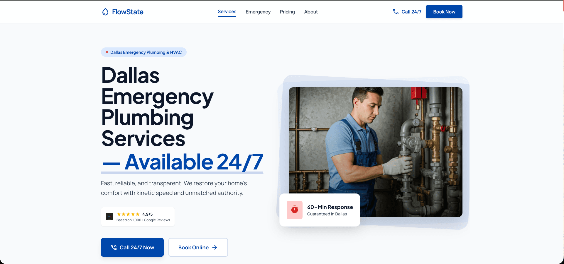
How we restructured it.
The redesign focused on clarity, speed, and conversion:
– Introduced a strong, action-driven hero section
– Prioritized “Call Now” and “Book Service” actions
– Reorganized content into a clean, structured layout
– Simplified service presentation based on user needs
– Added trust signals such as reviews and service guarantees
– Designed mobile-first to support on-the-go users
– Reduced visual noise to improve readability and focus
The goal was not just to modernize the design, but to create a system that encourages immediate action.
From search to call — in under 30 seconds.
- 1
Lands on the site
From Google search, Maps, or a referral.
- 2
Reads the headline
Immediately understands what service is offered and where.
- 3
Sees a clear action
A prominent call button — no hunting required.
- 4
Builds trust fast
Reviews, certifications, and response time shown above the fold.
- 5
Makes the call
One tap on mobile. No forms. No friction.
Same business. Different first impression.
The specific systems we built.
- Next.js
- Sanity
How we work.
01
Discovery
Understand the business, service area, and current user drop-off points.
02
Architecture
Restructure information hierarchy around the primary conversion action: the phone call.
03
Design
Build a minimal, high-contrast layout that communicates trust within seconds.
04
Launch
Deploy on a fast edge network with performance and local SEO best practices built in.
A website that works
at 2am.
The redesigned structure prioritizes immediate action by guiding users toward calling or booking a service within seconds of landing on the page. Clear hierarchy, simplified navigation, and strong trust signals reduce friction and make it easier for potential customers to take action—especially in urgent situations.
Faster decision-making. Reduced friction between intent and action. A layout that communicates trust before the visitor reads a single word.
This is what a conversion system looks like.
This redesign makes it much easier for customers to contact us quickly. The layout feels cleaner, and the call-to-action is much more noticeable.
Ready to start?